Project Overview
It's very difficult to find a unique design on skateboards and shops only offer standard colors.
To understand the user and create a product of them, I defined some responsibilites. Conducting interviews, paper and digital wireframing, low and high-fidelity prototyping, conducting usability studies, accounting for accessibility, and iterating on designs.
The Product
Design an efficient flow to order custom skateboards online.
Project Duration
May 2022 to June 2022
The Goal
A friendly site that the user can create their own skateboard design.
My Role
UX designer covered the design process from beginning to end on my own.
User Research: Summary
I conducted interviews and created empathy maps to understand the users I'm designing for and their needs. A primary group identified through research was that users want a unique design to their skateboards because is part of their lives and stickers doesn't provide what they want to convey.
The user group confirmed that is frustrating not to be able to personalize something that is so essential in everyday life, they use it to go to school, work, parks, friend's houses, etc and “everyone use the typical black skateboard or designs that don't represent me”.
User Research: Pain Points
Accessibility
It's frustrating that are no platforms to design a complete skateboard, from model to wheels.
Time
It's stressful and overwhelmed search several stores to make a skateboard by you own.
Experience
Online skateboards shopping websites don’t provide an engaging browser experience.
Problem statement:
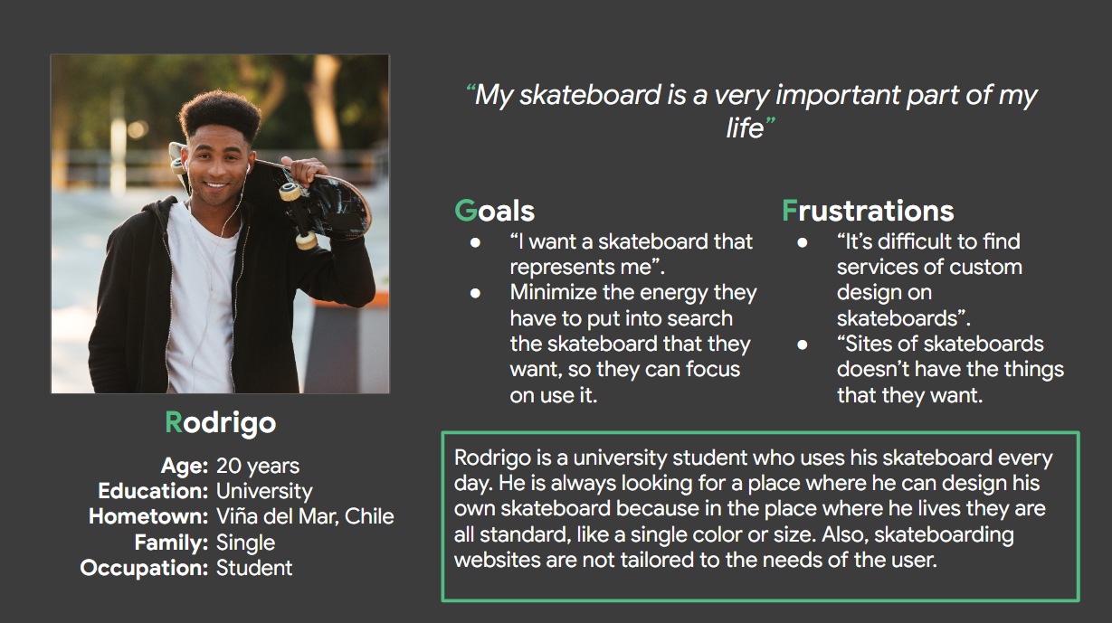
Rodrigo is a young student who needs a platform to design his own skateboard because it's important to feel identified with it.
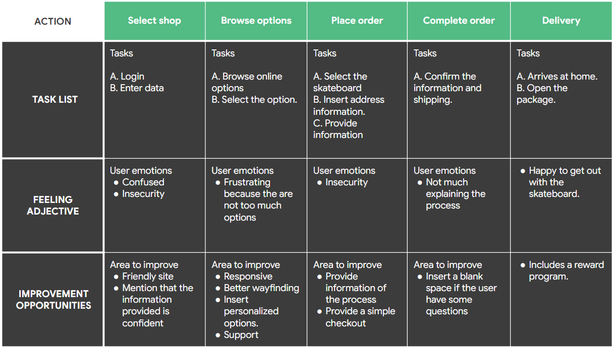
User Journey Map
Goal: Create a personalized skateboard design in a short time.
Site Map
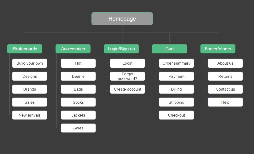
Difficulty with website navigation was a pain point for users, so I used that knowledge to create a sitemap after design the journey map.
My goal here is to make strategic information architecture decisions that improve overall website navigation. The structure I chose was designed to make things simple and easy.
Low Fidelity Prototype
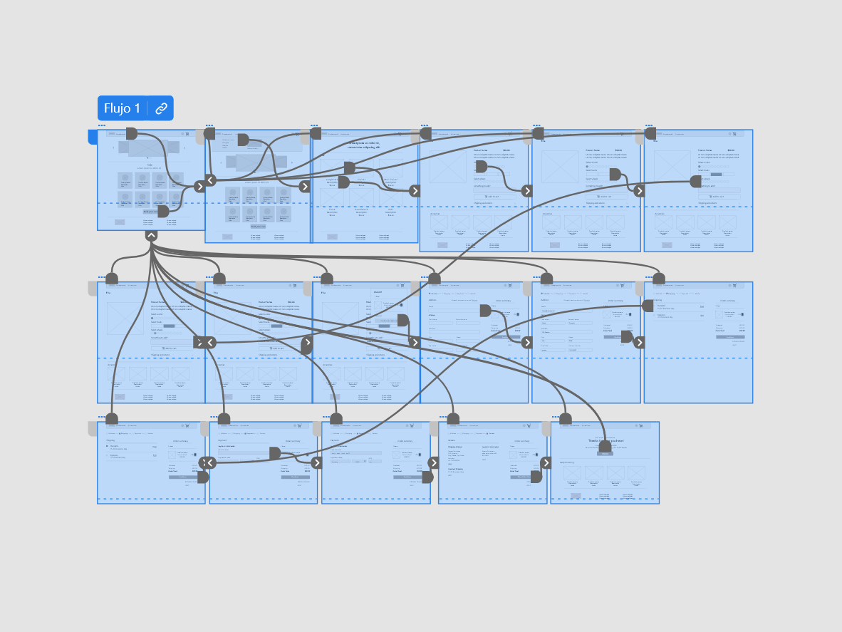
I sketch my paper wireframes, worrying that had different screen size variations. Then I moving from paper to digital wireframes made it easy to understand how the redesign could help user points and improve the user experience. The next step was to create the Sk8 Lover low fidelity prototype. At this point, I had receive feedback for my peers about things like placement of buttons and page organization. I made sure to listen to their feedback, and implemented several suggestions.
Usability Study: Parameters
Let's explore the parameters that shape this insightful investigation
Study Type
Unmoderated usability study
Location
Chile, remote
Participants
7 participants
Length
30-60 minutes
